Project Brief
Our team was approached by the Design department at York University to create a new equipment rental web platform for the YSDN program.
my Role
User Research, Ideation, Visual Design, Prototyping and User Testing
Team
Mohit Gupta (Me),
Carson Young, Zhen Li
Type and Timeline
Product Design, UI/UX, and Visual Design
February-April 2018
Tools Used
Sketch, InVision, Illustrator, Photoshop and After Effects
Understanding
the Target Audience
We started with conducting interviews with the administrators, monitors and students in the program to get a deeper insight into the problems and opportunities.
THE PROBLEM
The YSDN equipment rental program at York University allows students to select and rent out equipment to help complete projects requiring additional resources such as cameras, tripods and audio equipment. However, this system and process have yet to be digitalized, resulting in confusing policies, ineffective methods of enforcement, and unreported damage to equipment.
The key problems with the current system:
Still using paper documents to check-out equipment, and report any damage.
No digitized system for the students to book equipments online.
No proper database to track the inventory for all available, checked-out, damaged equipment, and any overdue student balance.
Unreported damage to equipment, creating an inefficient management system.
As a team, we were tasked with creating a digitalized system for not only for the students to book online, but also to help the staff (also called lab monitors) and administrators easily oversee and run the program.
The Need
Students want an easy booking and return process. They want to make sure that the equipment they booked is ready to pick up when they need them.
Monitors want to ensure that the equipment booked is in good condition for pick-up and can easily report damage or late fee during drop-off.
Administrators want to ensure that the location and condition of the entire inventory are tracked at all times. Have a database of all missing or damaged reports in one place.
Design Challenge
How might we design equipment checking in/out process that is simple and efficient for students, monitors, and the administration?
The Solution
Toolbox is an online web platform that allows an easy equipment booking process for students, a smoother check-in and check-out experience for monitors and a more informed and easily run inventory management system for administrators.
The platform allows students to book items online in advance of pickup, eases the checkout and return flows for lab monitors, and creates an efficient and standardized system to ensure all equipment is accounted for by administrators.
My Responsibilities
Since I worked on student check-out experience, I’ll be walk-though the collective process while mainly focusing on the student aspect of the project.
While we all worked together on the research, ideation and visual design phases. I was mainly responsible for student check-out experience from sketches to final prototype and user testing and also syncing twice a week with my team to make sure that the complete product experience is cohesive.
Research Phase
Stakeholder interviews, User persona, and PACT analysis, to help list all constraints and opportunities for the next steps.
Ideation Phase
Planning sitemap, System Requirement Chart, prioritizing important features and preparing user scenarios.
Visual Design Phase
Help with creating a visual design guideline to ensure the design system is cohesive throughout the platform.
Prototyping Phase
Build wireframes, prepare student user flows, user test the flows, iterate from feedback and design final prototypes.
Motion Design
Documenting all the flow in one product walkthrough video for the final presentation.
Research Phase:
User Personas
User personas based on stakeholder interviews helped us list all pain points and opportunities from a student perspective.
We began looking at this problem by conducting formal interviews with the different stakeholders that would be using the product. We kept our users (administrators, student lab monitors and students) in a loop throughout the product development process.
These stakeholders helped us better understand the problems with the current system. From these interviews and conversations, we crafted user personas and a PACT analysis to quickly summarized our research.
Link to Research: PACT Analysis | User Interview Plan


Research Phase:
Opportunities
After two meetups with the admins and interviewing some students from our program, we listed the core student needs for the platform.
Easy booking and returning process
Students want to browse the inventory and quickly browse what’s available and book the equipment they need.
Put a hold-on unavailable equipments
Put a hold request and get notified via email when the items become available.
Understand the rental agreement
The administration wanted to make sure that the students using the platform understand the rental agreement.
Quickly check any overdue balance
The administration wanted a clear way to address if a student owed money for late return or damage.
Check office hours and location
Some students didn’t know where the studio was located and suggested that it would be useful to have that info.
Research Phase:
Constraints
Since our professor has planned to pitch this project to University and get funding to develop the product, in reality, so understanding the constraints was important. The interviews and research helped us uncovered some major constraints we had to consider for our final solution.
No online payment option
The administration did not want to incorporate the online payment system due to technical constraints. They wanted to continue using the office front desk to collect payment for any late/damage fee.
Limited budget
Due to a limited budget, we had to scope out some features. It helped us focus on building a simple MVP solution.
Time constraint
We only had three months to build the product, so we wanted to make sure that all main problems were addressed in our proposed solution.
Ideation Phase:
Planning
Once we had all the research, we dived into quickly white-boarding the problem, listing down all the opportunities. We learned about Systems Requirement Chart (MoSCoW) methodology and found it really helpful in prioritizing the list of features but clarifying rationale, content and function of every single feature.
Some ideation questions I had to work through during this process includes:
What are some of the problems that student experience with the current system?
How might we create an easy and hassle-free checkout experience for students in YSDN?
How might we educate the students about the rental agreement before they request any equipments?
What would happen if a type of equipment that student needs is not available?
How might we notify the students about any overdue balance and damage fees they owe?
Ideation Phase:
SiteMap
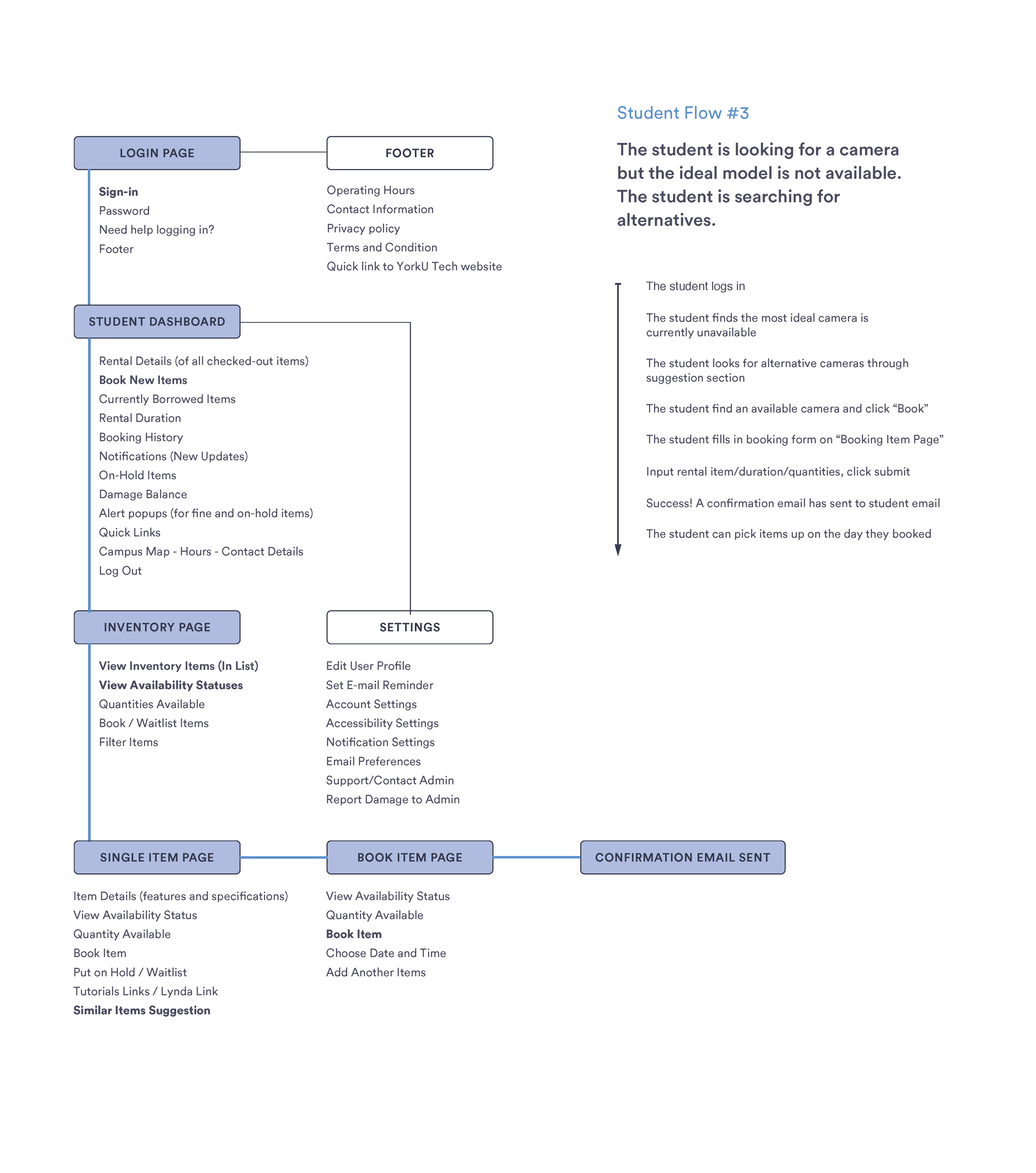
After listing down all the potential features to address the different pain points, we created a detailed site map outlining where each of Toolbox's features would be developed. This allowed us to get a grasp of how the complete platform would operate and what each of us need to focus on.
Ideation Phase:
User scenarios
The user flows provided clarity on where we should focus our efforts as a group and the necessary steps we had to design for. This helped our group realize we had some discrepancies with the system-focused mapping of our platform above and allowed us an opportunity to blend these two conceptual charts early. Here, I worked on planning the different user scenarios to address a solution for student’s core needs.
Visual Design Guidelines
Once we moved from the ideation phase to prototyping, we collectively worked on building a cohesive design system, while building also the product. This was a work in progress, we added rules and components to one file as we iterated the product.
Prototyping Phase:
Wireframes and Mockups
Starting with creating really low-fidelity sketches to get a general idea of what the interface would look like. We worked our way up building high-fidelity wireframes and visual mockups on Sketch.
Early sketches to plan out the interface
Low-fidelity mockups
High-fidelity iterations
Final Solution
After a long three months, our final solution is a collective effort that helps create a platform capable of making several significant improvements to the current rental program of YSDN. Following are the user flows for student checkout experience.
quick and simple checkout flow
A simple and intuitive checkout flow for students to check what’s available in the inventory and quickly request items after agreeing to the rental agreement.
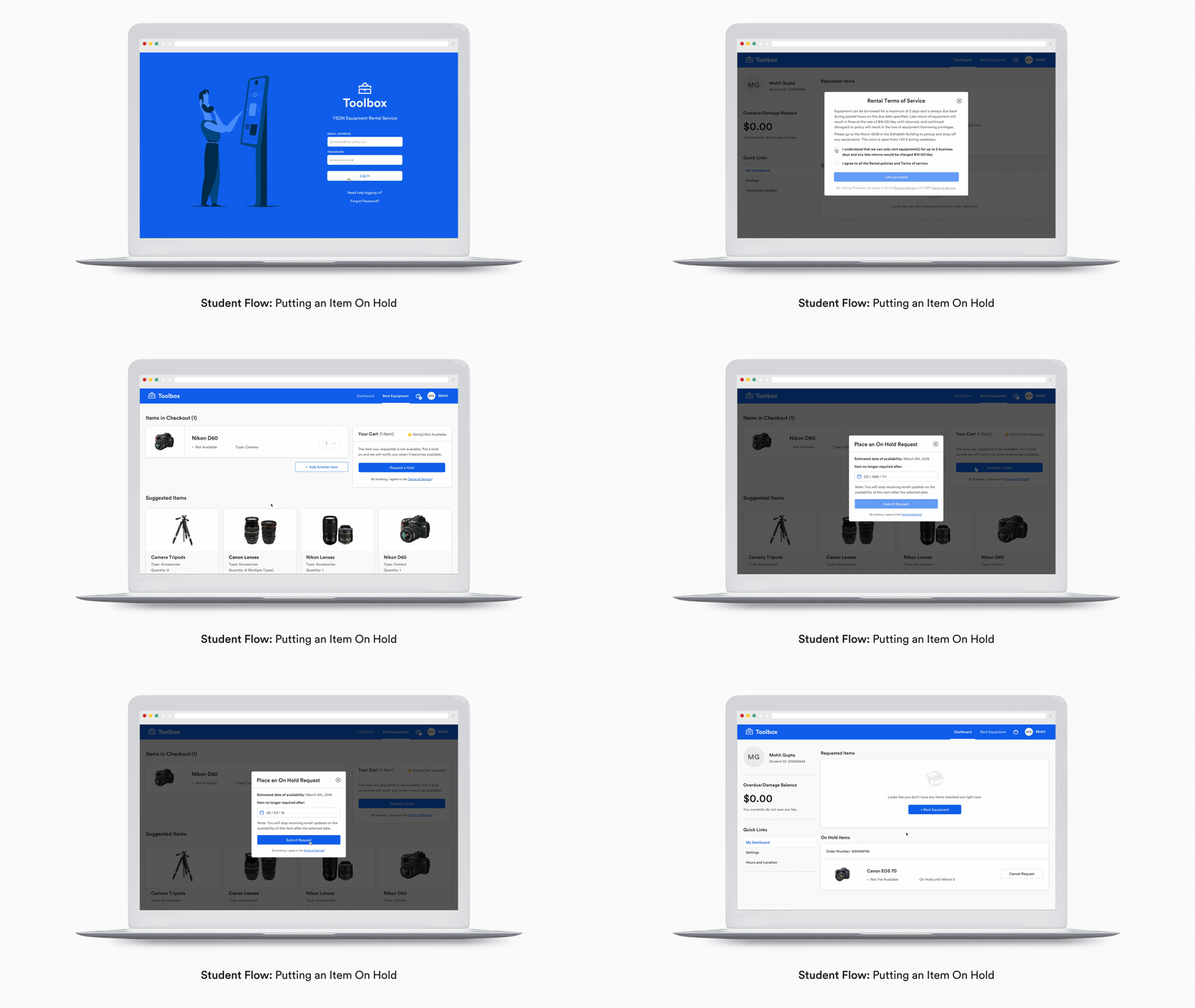
Place ‘on hold’ request for unavailable items
In case an item isn’t currently available, students can place an ‘On hold’ request. Students would receive email alerts for when requested item/s become available. The date picker allows them to select the date after which they no longer wish to be notified about the availability.
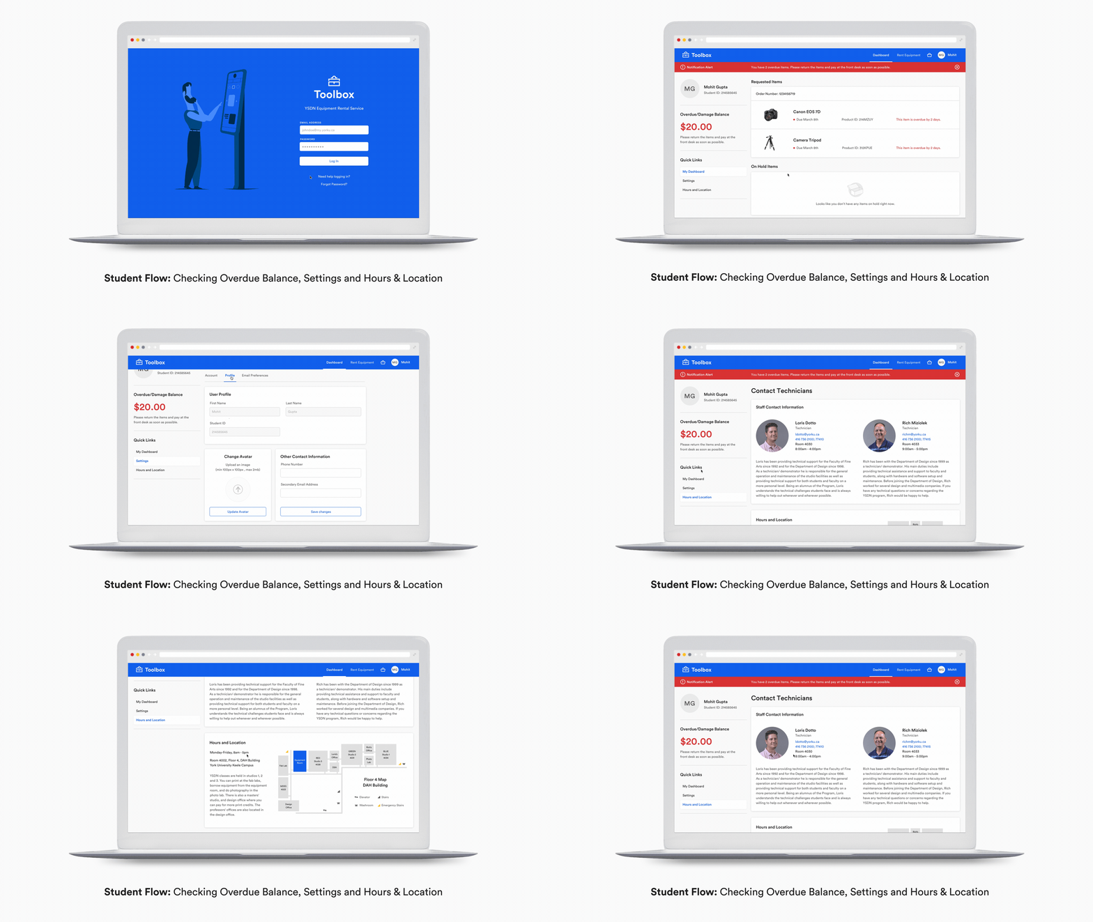
Check any overdue balance, hour, location and settings
A pop-up notification alerts the student owing any damage fees or has an overdue balance. Students can also check the hours and location directly from the dashboard.
User Testing
Our team had the opportunity to meet and test our product with our stakeholders, students, monitors and administrators. These testing sessions included 6 students, 2 monitors, and 1 administrator and allowed us to receive a lot of valuable feedback and insight. We gained some unique perspectives on the problem through this process.
Overall, users were able to navigate within the product fairly easily and intuitively. They were able to understand the information architecture of the product quickly. They were also excited about the features Toolbox had to offer. We found that there were some way-finding and visual clarity issues, such as confusing labels on CTAs, inconsistent icons, and a lack of personalized features for the different user types. Through this testing, we were able to detect these issues early and iterate on them.
Complete Platform Walkthrough
Reflection
Toolbox was a third-year project, it was the first project where we had the opportunity to conduct detailed primary research before jumping into a solution. We also had the opportunity to test with real potential users. I think the research, interviews and testing were really helpful in putting away all the assumptions and focusing on the core needs of the target audience. It also helped us better understand the constraints of the project.
Collaboration is key
We each took responsibility for designing different user group but always reviewed our progress twice a week with each other to make sure the product is cohesive throughout.
Viewing problems from a user’s perspective
Some design decisions may seem too obvious as a designer, but may not be very obvious to a user. User testing really helped us in making informed design decisions.
Learned new process for building product
Learned properly planning a sitemap and using System Requirement Chart was really helpful in prioritizing important features and scoping the product for a simple MVP.


